Eurovision has been and gone, and love it or hate it it provides some nice data which I can use to demonstrate some statistics (hurrah). Let's get eurostatting:
One commonly held belief about Eurovision is that it's much better to perform early or late in the running order rather than somewhere in the middle. This is thanks to the
serial position effect; we generally remember items in the middle of a list less well than those at the beginning (primacy effect) and end (recency effect). This year, however, a change was made to the Eurovision voting process - viewers could vote for their favourite song all the way through the competition, not just after hearing the final act. When I first heard this I was a bit nonplussed - how does letting people vote before they've heard all the songs make things fairer? I wonder if it will even have any effect...
Predictably, this led me to stay up til the early hours playing with data as I tried to answer two questions:
1) Is there evidence of a primacy/recency effect in Eurovision results?
2) Were there any appreciable changes to voting patterns this year, after the introduction of the new voting system?
To start with (as always) I go data mining. Thanks to the Internet, I can quite easily get hold of the results of as many Eurovision finals (and from 2004 onwards, semi-finals) as I'd like. I decided to take my dataset from 1998 onwards, as this is the first year where universal televoting was recommended, and so seem the most relevant to the present day.
So how do we go about investigating question 1? Whenever I start exploring data I always like to try and make some plots - the human eye is great at picking out patterns (admittedly sometimes where there aren't any to begin with...), and graphics are a great way to communicate data. So which data do I want to look at? I'm interested in identifying whether performing later or earlier means a country does better, and so for that I'm going to want the order in which they performed and the position they finished in. Is this good enough? Not quite. Because the number of countries entering the contest has fluctuated over the years (as well as differences between finals and semi-finals), from year to year the numbers are not yet comparable. For example, knowing a country finished 10th or performed 15th is a little meaningless if we don't know how many others it was competing against.
To make our numbers comparable we need to standardise them - fortunately a fairly easy procedure. For each of our individual contests we just divide a country's finishing position and performance order by the total number of countries competing in that particular competition. For example, a country finishing 25th out of 25 will be converted into a finishing 'score' of 25/25 = 1. Meanwhile, a country finishing first will have a lower finishing 'score' the more countries it was competing against (finishing 1st out of 10 would score 0.1, and is a better result than finishing 1st out of 5, which would score 0.2). The same logic is applied to performance order, so performing last always scores 1 and performing 1st scores less the more countries that are competing.
Now that we've standardised our data, we want to get back to plotting them, right? But what's the best sort of plot to use? All of our data are pairs of points - one finishing score and one performance order score, so can we just plot these as a scatter graph? Let's try that and see what happens:

Yikes. That's quite a mess. There are no particularly obvious patterns, so what do we do now? I think we need to manipulate our data a bit more to make it more accessible (and amenable to a different type of analysis).
We're going to simplify the data a little. Rather than looking at the specific finishing position and performance order for every country, we shall instead split them into quartiles. That is, we reduce our data to whether a country performed in the first, second, third or final quarter of contestants in a competition, and similarly whether they finished in the top, second, third of bottom quarter. Doing this, we can tabulate the simplified results:

As is hopefully discernable, each column corresponds to a performance order position - 1 means the first quarter, 4 the last quarter. Similarly, each row corresponds to a finishing position - 1 means finishing in the top quarter and 4 in the bottom quarter. We're interested in whether performance order affects finishing position, so we can make these data a little easier to interpret if we take column percentages - that is, for each column we calculate what proportion of countries that performed in that quarter then finished in the top, second, third and bottom quarter.

It's still a bit of a sea of numbers, but we can already see some interesting results - countries performing in the first quarter of a contest tend to do quite poorly, with 35.8% of such countries finishing in the bottom quarter, and 67.9% (just over two-thirds) finishing in the bottom half. Pretty much the opposite happens for countries performing in the final quarter; 34.4% go on to finish in the top quarter and 63.9% (just under two-thirds) finish in the top half. It seems our initial hypothesis was only half right - there's evidence here of a recency effect but not a primacy one. But could this just be down to chance?
Here we are interested in testing a hypothesis, specifically whether there is evidence of an association between performance order and finishing position. In statistical terms, this is our 'alternative hypothesis'. This is as opposed to a 'null hypothesis', which for us is that there is no association between performance order and finishing position. What a hypothesis test does is look at the data and ask whether or not it seems plausible they could have come about under the null hypothesis, in other words, is the pattern we think we see above merely due to chance?
The data are now in a rather nice format with which to perform
Pearson's chi-square test. Put simply, this test takes our null hypothesis (that performance order has no impact on finishing position) and looks at how much the actual results deviate from what we would expect were this really the case. It's a powerful procedure, but also a fairly simple one, and whilst I shan't go into the mechanisms of it here, the wikipedia page explains it fairly well, and is hopefully penetrable to most with some A level maths in them.
From our tables above, it looks like our null hypothesis of no relationship between finishing position and order performance is false, but what does the statistical test say? The main output of the test I'm going to use here is a
p-value, which is a commonly used means of testing a hypothesis. Discussion of p-values is really a post in itself, so I shan't go into too much detail here. What I will say, however, is that in most cases if a p-value is calculated as being less than 0.05 many will consider this reasonable evidence that the data being investigated are not consistent with the null hypothesis. In our case, a p-value of less than 0.05 would imply that there is evidence that our data do not seem to agree with the null hypothesis of no association between a country's performance order and finishing position.
Running the test, we get a p-value of 0.0001, which is much, much smaller than 0.05. Consequently most statisticians (myself included) would be happy to conclude that the data do not seem at all consistent with the null hypothesis; there is evidence of an association between performance order and finishing position.
As for question 1 then, we've established that there does indeed seem to be a relationship between finishing position and performance order. I should stress however, that we haven't actually shown what sort of relationship it is. Our statistical test just tells us that our observed data deviate from what we would expect sufficiently much to suggest they aren't just being scattered at random (there are things we could do to investigate the relationship further, but I think that's a tangent that will have to wait for another day). From the tables above though, it seems that countries who perform later do better, whilst those that perform earlier to worse - there is evidence of a recency effect, but not a primacy one. Who'd've thought after two hours of music you wouldn't remember the opening act?
But anyway, now that's dealt with we can finally move onto our second question - do we have any evidence that with the introduction of a new voting system anything has changed? To test this, we'll use the data from this year's contest - two semi-finals and a final, and take a similar approach. One complication emerges, however - Spain performed twice in the final after a stage invasion during their first performance - how can we take this into account? I've decided to just drop them altogether from the analysis, as there does not seem to be an obvious way to include them, and they are clearly a rather distinct case from all the other entries.
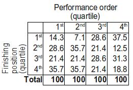
Having done this, we once again, split performance order and finishing positions into quarters, and report our results in a table:

Or, we can conver to column percentages again (that is, for each performance order quarter we can see what proportion of countries finished in each quarter overall). You'll have to forgive the odd rounding error...

To the eye, it's not quite as clear cut as it was with the older data, although the largest proportion of countries appear in the top right and bottom left cells as before. If we look a bit further though, there's less convincing evidence - recall that earlier over two-thirds of countries who performed in the first quarter went on to finish in the bottom half, here that proportion is just 57.1%. Furthermore, until this year 63.9% of countries who performed in the last quarter finished in the top half, this year that figure is 50%, just what you'd expect. Maybe things have changed...
Let's forget the guesswork though, we can just do another Pearson's chi-square test, right? Well unfortunately we can't. Pearson's chi-square test requires us to have sufficiently many observations to make some of its underlying assumptions valid, and we just don't have enough data. Fortunately there is another test -
Fisher's exact test - which we can use when our sample size is this small. Like Pearson's test, it's fairly easy to compute (although again I'll spare the details), and running it we get a p-value of 0.6381. This is rather large, and suggests that our data are consistent with the null hypothesis - in other words, it seems that performance order doesn't have an effect on finishing position under the system.
I would, however, not set too much store by this conclusion. As mentioned, this is based on just three 'contests' - two semi-finals and a final - and so our test is not particularly powerful. When we have fewer data it is much harder to convince ourselves that we have found evidence of some sort of relationship - there is too much that can change due to chance. For example, if you toss a coin 100 times and get 30 heads and 70 tails you'd be fairly suspicious about it being biased. If you tossed it 10 times and got 3 heads and 7 tails however, you'd probably just think this was reasonable for a fair coin, and think this disproportionate result was just down to chance.
Still, it's a promising start, and it will be interesting (assuming this new voting system is maintained) to see how future years' data stack up when combined with what we have. Maybe it's not so silly to let people vote as they go along after all...