Sunday, 22 September 2013
On holiday
Amongst the madness that has been moving country All Models Are Wrong is taking a sabbatical. If and when things return to approximately normal updates will be made through the usual channels. (Although in the meantime, my (much less time-intensive) quiz blog remains moderately active.)
Monday, 20 May 2013
The Fantasy Premier League table
The English Premier League concluded on Sunday and, while there was little to play for for most teams, there was still late drama, ridiculous scorelines, and some even more ridiculous hair.
Sunday also saw the conclusion of the fantasy football season with the Premier League's official game going right down to the wire. Being something of a fantasy football nut myself (and inspired by a question from a friend) I got wondering about how the Premier League table might have looked if it was fantasy, rather than real, points that counted.
In case you're unfamiliar with the wonderful time sink that is fantasy football all you need to know is that (real) footballers score (fantasy) points for various achievements on the pitch. How many points they get depends on their position but as a rule doing things that are good for your team (scoring goals or keeping clean sheets) earn you points while things that are bad for your team (getting booked pr conceding lots of goals) lose you points. Obviously there's rather more to it than that, but those are the basic principles.
It seems reasonable, then, that fantasy points should match up pretty well to real points. To see quite how well I ran the numbers: for every team in the Premier League I totalled up the fantasy points scored by all their players. (The only slight complication was that some players changed club partway through the season, but this only affected a handful of individuals who I dealt with manually.)
Here's how the fantasy table worked out, complete with the ranking differences between this and the real Premier League table. Teams in green gained places in the fantasy world, teams in dropped down, and teams in blue stayed the same (click for big).
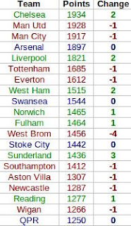
In the fantasy world Chelsea leapfrog both Manchester clubs to take top spot. This seems mainly down to where their goals came from. In this fantasy game a player gets more points for scoring a goal if they're a midfielder than if they're a striker. United's goals mainly came from Wayne Rooney and Robin van Persie - their forwards - while Chelsea profited much more from their midfield with a bulk of their goals coming from Juan Mata, Eden Hazard and, of course, Frank Lampard.
Elsewhere in the table there's not much movement, with only West Brom's fall of four places and Sunderland's rise of three standing out. The reasons for these are less clear (although one should bear in mind how tight the real Premier League table was in these areas), but West Brom did keep relatively few, and Sunderland relatively many, clean sheets.
As a final experiment (and to make this a little bit more statsy) I thought I'd see how well we could estimate a team's fantasy total based just on how many goals they scored and how many times they kept a clean sheet. Fitting a linear model suggested the following equation for estimating fantasy points for a team based solely on these two pieces of information:
Fantasy Points = 718 + 9G + 34C
where G stands for 'goals scored' and C for 'clean sheets kept'. In other words, with this very simple model (which nevertheless explains 97% of the variation in teams' fantasy scores) we find that the average goal is worth nine points, and the average clean sheet is worth 34. (The 718 at the front, meanwhile, is largely down to the fact that players usually earn two points simply for playing the match.)
There's not much more to say that doesn't involve devolving into a rather ludicrous level of fantasy football geekery, so I think I'll leave it at that. Now to work out what to do for the next two football-free months...
Sunday also saw the conclusion of the fantasy football season with the Premier League's official game going right down to the wire. Being something of a fantasy football nut myself (and inspired by a question from a friend) I got wondering about how the Premier League table might have looked if it was fantasy, rather than real, points that counted.
In case you're unfamiliar with the wonderful time sink that is fantasy football all you need to know is that (real) footballers score (fantasy) points for various achievements on the pitch. How many points they get depends on their position but as a rule doing things that are good for your team (scoring goals or keeping clean sheets) earn you points while things that are bad for your team (getting booked pr conceding lots of goals) lose you points. Obviously there's rather more to it than that, but those are the basic principles.
It seems reasonable, then, that fantasy points should match up pretty well to real points. To see quite how well I ran the numbers: for every team in the Premier League I totalled up the fantasy points scored by all their players. (The only slight complication was that some players changed club partway through the season, but this only affected a handful of individuals who I dealt with manually.)
Here's how the fantasy table worked out, complete with the ranking differences between this and the real Premier League table. Teams in green gained places in the fantasy world, teams in dropped down, and teams in blue stayed the same (click for big).
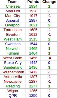
In the fantasy world Chelsea leapfrog both Manchester clubs to take top spot. This seems mainly down to where their goals came from. In this fantasy game a player gets more points for scoring a goal if they're a midfielder than if they're a striker. United's goals mainly came from Wayne Rooney and Robin van Persie - their forwards - while Chelsea profited much more from their midfield with a bulk of their goals coming from Juan Mata, Eden Hazard and, of course, Frank Lampard.
Elsewhere in the table there's not much movement, with only West Brom's fall of four places and Sunderland's rise of three standing out. The reasons for these are less clear (although one should bear in mind how tight the real Premier League table was in these areas), but West Brom did keep relatively few, and Sunderland relatively many, clean sheets.
As a final experiment (and to make this a little bit more statsy) I thought I'd see how well we could estimate a team's fantasy total based just on how many goals they scored and how many times they kept a clean sheet. Fitting a linear model suggested the following equation for estimating fantasy points for a team based solely on these two pieces of information:
Fantasy Points = 718 + 9G + 34C
where G stands for 'goals scored' and C for 'clean sheets kept'. In other words, with this very simple model (which nevertheless explains 97% of the variation in teams' fantasy scores) we find that the average goal is worth nine points, and the average clean sheet is worth 34. (The 718 at the front, meanwhile, is largely down to the fact that players usually earn two points simply for playing the match.)
There's not much more to say that doesn't involve devolving into a rather ludicrous level of fantasy football geekery, so I think I'll leave it at that. Now to work out what to do for the next two football-free months...
Thursday, 16 May 2013
Predicting Eurovision finalists: would you beat a monkey?
Over on my quiz blog, I've taken a brief detour into the world of Eurovision, specifically the difficulty of predicting which countries will qualify from this week's semi-finals. The background to this post can be found there, whereas here I'll be going into slightly more detail about the maths behind the results. (And in the unlikely event you've arrived here first, I'd strongly recommend reading the original post first.)
Starting with the first semi-final, the problem is relatively straightforward to summarize: you simply need to pick 10 winners from a field of 16. (To aid intuition, it's helpful to notice that this is equivalent to picking 6 losers from the same field, but in either case the solution is relatively straightforward.)
As always it's a good idea to start simple. To get all 10 correct is a simple matter of choosing the right 10 countries from 16. There are 8,008 ways to choose 10 items from a list of 16 (see here if you're unfamiliar with how we can arrive at this number so effortlessly), so you have a 1 in 8,008 chance of picking all 10 qualifiers if you choose at random. Pretty slim, but not too ridiculous.
Next, say you got 9 correct, how good is that? To answer this we need to know the probability of picking at least 9 qualifiers or, equivalently, the probability of picking exactly 9 or exactly 10. We have the latter already, so what about the former?
We know there are 8,008 different ways to choose the 10 countries we think will go through. The question, then, is how many of these 8,008 ways correspond to having exactly 9 correct predictions. The answer comes fairly intuitively if we imagine trying to deliberately construct a set of 10 predictions made up of 9 winners and 1 loser: we just choose 9 of the 10 countries who qualified and 1 of the 6 who went out. There are 10 ways to choose 9 things from 10, and 6 ways to choose 1 from 6, giving us 10 x 6 = 60 ways to pick 10 countries of which exactly 9 will progress to the final. Adding this to the 1 way that gives us all 10 qulifiers means we're looking at 61 of the 8,008 possible ways to predict 10 countries: our Eurovision-loving monkey has about a 1 in 131 chance of picking at least 9 qualifiers correctly.
This method easily extends to less successful attempts. For exactly 8 correct predictions we need to choose 8 of the 10 winners and 2 of the 6 losers. There are 45 ways to do the former and 15 to do the latter giving us 45 x 15 = 675 ways to get exactly 8 correct. Add this to the 60 ways to get exactly 9, and 1 way to get exactly 10, and we hit 736 out of 8,008, or about a 1 in 11 chance of getting at least 8 qualifiers correct. The method extends downwards for less successful predictions (and you can get the full results table over in the quiz blog post).
The only other question is how to modify this to work for tonight's 17-country semi-final. The same logic applies, and most of you could probably work this out yourself from here. Rather than 10 winners and 6 losers, you're now looking at 10 winners and 7 losers. There are 19,448 ways to pick your 10 qualifiers from the 17 countries, and just 1 of those will give you a full set: you already have less than half the chance to hit a perfect 10 than you did on Tuesday.
What about 9 correct? Applying the same procedure we can easily see that there are still 10 ways to choose 9 of the 10 winners, but there are now 7 ways to choose 1 country from the set of 7 losers. This gives 10 x 7 = 70 ways to get exactly 9 correct qualifiers in the 17-country set-up, or 71 out of 19,448 (1 in 274) ways to get at least 9 qualifiers right on the night. Again, full results can be found on the quiz blog.
That's all there is to it. A neat problem, I think, with a similarly neat solution. It's also an interesting lesson in how easily numbers can deceive: getting 7 out of 10 qualifiers right on Tuesday might have seemed good, but it's the same as identifying just 3 of the 6 losers. You'll have still done (slightly) better than a monkey, but it's probably not quite something to sing about.
Tuesday, 12 March 2013
The Pope vote: could it be left to chance?
 |
| Fancy! |
To answer this, we first have to decide how many options each cardinal has to pick from. Strictly speaking, they have 114 choices (you can't vote for yourself, apparently), but in reality there are only a handful of papabili. A quick look at the betting markets suggest that there are three primary contenders: Angelo Scola, Peter Turkson and Odilo Scherer all have odds of around four to one. Canadian Cardinal (one of the less successful superhero franchises) Marc Ouellet is next at eight to one, while the remaining candidates can only really be described as long shots so hopefully can be safely ignored (famous last words).
Let's start simple and assume there are only two options. If every cardinal tosses a coin to decide between, say, Scola and Turkson (one of the less successful 70s detective dramas) then how long could they expect to be admiring Michelangelo's handiwork? In other words, we want to know the chances of tossing a coin 115 times and getting either at least 77 heads or at least 77 tails (we don't care which of them wins, we just want to go home). Conveniently, the chances of the former are the same as the chances of the latter, and so we only need to calculate one of them and then double it. This is a fairly standard problem so I'll spare the details and just tell you that the odds of seeing 77 or more heads from 115 tosses is a pretty minuscule 1 in 5,700, which gives the Coin-tossing Cardinals of the Conclave (one of the less successful prog rock bands) a 1 in 2,850 chance of getting a Pope. With four conclaves a day that works out to, on average, nearly two years of voting before somebody is elected. I hope they packed a change of cassock.
If they have any more candidates to choose from, meanwhile, things get predictably worse. With third-favourite Scherer added to the pool of potential Popes they would be looking at 1,2 billion years in the Sistine Chapel, and if Ouellet got into the mix I'd have to resort to this Wikipedia page.
After Benedict's resignation, some quarters picked up on a prophecy which alleges that the next Pope's pontificate will usher in the beginning of the Apocalypse. If those 115 cardinals are picking at random, we'll be lucky to get that far.
Thursday, 14 February 2013
Football formulae: the maths behind the Champions League draw
A somewhat belated follow-up to this post, where I looked at the probability of the draw for the Champions League knockout stage matching the preceding day's rehearsal draw. We have an article for the print magazine in the pipeline, so this is a little short on detail, but there is a surprisingly large amount of interesting stuff behind this problem.
I can (hopefully) be heard discussing a small aspect of this on the BBC's World Service program More or Less this coming Saturday, at 1350 UTC, although I make no guarantees that my segment won't end up on the cutting-room floor.
I can (hopefully) be heard discussing a small aspect of this on the BBC's World Service program More or Less this coming Saturday, at 1350 UTC, although I make no guarantees that my segment won't end up on the cutting-room floor.
Monday, 14 January 2013
From the archives: does the best picture win?
 |
| Oscar Mike |
It turned out that average review scores weren't particularly good at predicting the best picture, with just five 'Metacritic favourites' winning in the 18-year period I investigated. Since then, this number has crept up: while the 2011 winner The King's Speech was a mere fourth favourite, last year The Artist became the sixth top-rated movie to actually win.
This year, spy thriller Zero Dark Thirty leads the field, with a Metacritic score of 95. Best Foreign Language nominee Amour is a close second on 93, with a (relatively) big drop down to 86 where three films are lurking in third place. However, it's one of these three - the aforementioned Lincoln - which is currently the runaway favourite with the bookmakers.
It seems, then, that the stage is set for another non-'favourite' to take the top prize. However, should the bookies be proved correct, the makers of Zero Dark Thirty can at least console themselves with this fact: with a Metacritic score of 95 it will become the 'best' losing picture in the last 20 years.
Friday, 11 January 2013
Book review: Seeing the bigger picture
Time for another review. I got my hands on a well-presented book full of shiny infographics summarizing various global statistics. Unfortunately it didn't live up to expectations, with rather a lot of 'classic' statistical mistakes lurking in its graphics. (Also, I was relieved to discover at least one other statistically-minded reviewer had similar issues with it.)
Friday, 4 January 2013
Predicting Countdown's 30th Anniversary Tournament (Part 2)
This post summarizes the findings of my Countdown 30th anniversary tournament predictions, the background to which can be found here. Below are the top 10 favourites, complete with their online ratings and their rank (out of 41) of all those competing.
Conor Travers and Innis Carson are the top two ranked players in the field, and the top two favourites for the title. Perhaps surprisingly, Travers is 5% more likely to win than Carson, despite their near-identical ratings and Travers having to play an extra game (having been drawn into a preliminary match). This reflects the challenge facing Carson during the first two rounds, where he faces the number 8 and (probably) number 6 seeds before meeting number 2 seed Travers in the quarter-final.
Full results can be found here where, should you feel so inclined, you can play around with the ratings and see how things change.
| Name | Rating | Rank | Win % |
| Conor Travers | 2099 | 2 | 20% |
| Innis Carson | 2100 | 1 | 15% |
| Jack Worsley | 1992 | 5 | 12% |
| Chris Davies | 1998 | 4 | 10% |
| Jack Hurst | 2015 | 3 | 9% |
| Steven Briers | 1960 | 8 | 8% |
| Kirk Bevins | 1988 | 6 | 6% |
| Mark Deeks | 1964 | 7 | 5% |
| Jon O'Neill | 1847 | 13 | 3% |
| Edward McCullagh | 1873 | 10 | 2% |
Full results can be found here where, should you feel so inclined, you can play around with the ratings and see how things change.
Predicting Countdown's 30th Anniversary Tournament (Part 1)
To celebrate its 30th anniversary Countdown is hosting a very special tournament. 41 past champions have been invited back for a battle royale of letters and numbers. With such a high quality field, picking a likely winner is no easy task, and so I thought I'd take a statistical approach to predicting who might come out on top. If you just want to see the results, I've put them in a separate post, but if you're interested in some of the stats behind them read on...
Before I could start I needed some measure of how good each player is. Fortunately, a lot of them play a very similar game at apterous.org, which calculates a rating based on their online play (you may be familiar with similar systems in, for example, the chess world). From here we get ratings for 28 of the 41 players, which is good, but still leaves us with some work to do.
 One of the competitors - series 65 champion Graeme Cole - has produced some statistics for all those taking part. (Along with a handy diagram of the tournament structure.) One of these stats will serve as a proxy measure of ability: 'max percentage'. This is the proportion of the total possible points available players actually scored during their televised appearances. Obviously there are lots of reasons why these data aren't ideal, but they're the best we've got, and for those players who do play online they correlate pretty well with their ratings. Fitting a simple linear regression model of ranking against max percentage (which worked surprisingly well) we can then estimate ratings for those players who don't play online. The figure (click for a bigger version) summarizes the relationship: it's fairly noisy but good enough for a bit of fun.
 Now that we have an estimate of every player's skill, the next challenge is estimating the probability of, say, a player with a rating of 1600 beating a player with a rating of 1500. Once again, apterous data lend a hand, with tens of thousands of recorded games giving an insight into just this sort of question. This time, a logistic regression model does the trick, allowing us to estimate the relationship between the difference in ratings between two players and the probability that each player will win. For example, a player who is rated 100 points higher than their opponent would be expected to win about 63% of the time, shooting up to 93% for a 500 point advantage.
From here, it's relatively straightforward to calculate the probability that each player will be crowned champion. To find out what they are just go to part 2.
Sunday, 30 December 2012
From the archives: goalfest in the Premier League
Yesterday evening saw one of the highest scoring English Premier League matches of all time. Arsenal's 7-3 drubbing of Newcastle joins just three other 10-goal games, although Portsmouth's 7-4 victory over Reading in 2007 remains the outright claimant for this particular accolade.
This was just one part, however, of a Saturday chock-full of goals, with a total of 35 scored across the eight matches played. This put me in mind of an article I wrote for Significance early in 2011 about an even more extraordinary day of football. Back then, Arsenal and Newcastle were at it again, with the latter's stunning four-goal comeback contributing to a whopping 41 scored across that day's eight Premier League games. In the article I used this as an excuse to show off the Poisson distribution, demonstrating how goals scored in football matches can be modeled surprisingly well by what is ultimately a (fairly simple) mathematical formula.
The remaining two matches of that particular weekend of football only produced two more goals, bringing the total for a complete 10 match 'round' of Premier League fixtures to 43. Based on the Poisson distribution (and assuming an average of 2.6 goals per game) I estimated there was a roughly 1 in 720 chance of seeing at least that many goals in a set of 10 games. This weekend's football was almost - but not quite - as remarkable, with six goals today bringing us to a total of 41 across 10 matches. Based on the same theory, this works out to a 1 in 250 occurrence.
Thursday, 20 December 2012
Christmas games theory
Through a coincidence almost as implausible as the Champions League draw, today also sees a new article of mine go up on Significance. The idea was simple: find interesting stats/maths things to say about popular Christmas-time board games. Not making the cut was a discussion of the inevitable unfairness of dice (and an excuse to talk about Awesome Dice Blog's 20,000 roll experiment to compare two manufacturers), and how to use the Markov chain nature of a game of Snakes and Ladders to estimate how long it will take you to finish (40 rolls in the MB version, apparently).
What are the chances: Champions League draw exact repeat of rehearsal
The draw for the UEFA Champions League knockout stage took place earlier today, but it wasn't just the prospect of some truly mouthwatering ties making the headlines.
Observant eyes spotted a seemingly spectacular coincidence: today's draw was a near-identical repeat of that produced during Wednesday's rehearsal. While the order the ties came out was different, every single match featured the same pair of teams. So what were the chances of that?
It seems almost unbelievably unlikely, and an 'ESPN statistician' apparently gets an answer of roughly 1 in 2 million. On face value this makes sense: there are about 2 million possible ways of drawing 8 pairs of matches between 16 teams (the first team has 15 opponents to 'choose' from, then once that match is decided the next team has 13 opponents to choose from, and so on, giving 15 x 13 x 11 x 9 x 7 x 5 x 3 = 2 million (ish) possibilities). Unfortunately, this overlooks a large number of factors that drastically reduce the number of possible matches.
First of all, those teams who qualified as group winners in the previous stage of the competition can only be drawn against teams who qualified as group runners-up. With 8 teams in each 'half' of the draw (so to speak), this immediately drops us down to 8 factorial, or 40,320 possible matches. On top of this, however, no team can be drawn against the other team who qualified from their group, or even a team from the same football association. With 2 Spanish, 1 English, and 1 Italian team on each half of the draw, the number of 'valid' draws becomes even smaller.
The upshot of all of this (and an admittedly lazy brute-force approach) is that there were just 5,463 possible draws that could have been made that satisfied all of these rules, giving chances of two identical draws in a row of about 0.02%. That's still pretty staggering, but nowhere near the 1 in 2 million we started off with.
Update: It has been pointed out to me that while there are 5,463 possible draws, due to the mechanics of the draw process itself (the specifics of which I was not aware of at the time of writing) not all draws were equally likely. However, the different draws do still have very similar probabilities, and there is nothing obviously special about this particular combination of fixtures. More on this to come.
Monday, 3 December 2012
Book review: How to study for a mathematics degree
My first foray into book reviews (well, since primary school, at any rate).
Tuesday, 6 November 2012
Winning the White House (the easy way)
In a bid to create a more easily accessible list of my articles for the Significance website, I'm going to start updating this thing with links to them (maybe with some bonus content if there is anything I couldn't fit in).
It's (US) election day, so here's an article about how to win the Presidency with as small a share of the popular vote as possible. In the process of doing this, I tried a few other things that I didn't think quite made the cut.
After dealing with some trivial(ish) cases, I base my calculations in the article on turnout at the 2008 election. However, I thought I'd see what happens if I assume every member of the electorate voted. Unsurprisingly, not much changes: the minimum popular vote share required increases only a little to 22.3%.
I also looked at the analogous problem for becoming Prime Minister (assuming I had somehow persuaded a major political party to appoint me their leader). The maths is a lot more straightforward for the UK, as we just have one parliamentary seat per constituency (so none of this electoral college business). With 650 seats available, I'd simply have to win the 326 constituencies with the lowest turnout to form a (very) minority government. Admittedly, our politics are rather more complex than the two-party system stateside, but if we continue to assume 50% of the vote is required to win a constituency, then at the last general election a party could have won with just 22.1% of the national vote (the Liberal Democrats, by comparison, received 23%).
Tuesday, 19 June 2012
Eurovision 2012: split jury/televotes are in!
After several months of inactivity on here (mainly owing to the combined powers of a PhD thesis and steadily worsening eyesight), submission of the former and surgery to remedy the latter means I suddenly find myself with considerable time of my hands. Fortunately, I have found the perfect excuse to get back into the blogging boat (that's a thing, right?): the Eurovision Song Contest.
It may not seem the most topical of subjects, with this year's competition a relatively distant memory (if you don't recall, try and remember when it wasn't raining), but the long-awaited split jury/televote results are finally here, allowing for one last bit of fun. In case you're unfamiliar, the points awarded by countries in the Eurovision Song Contest are determined by an equal weighting of votes from the public (the televote) and a jury of music 'experts' (the jury vote). Introduced in 2009, the idea was to try and water down the alleged 'political' voting that many (particularly on these shores) thought was spoiling the contest, with juries theoretically providing a much more objective assessment of the songs. Whether this works in practice is for another time, but for now we can at least have some fun seeing how various countries performed under each system. This year's highlights include:
- There can be no argument over Sweden's triumph, with Loreen finishing on top in both votes. This makes it three times out of four that the public have chosen the same winner as the juries, the only exception being Azerbaijan's win in 2011 where the jury placed them a lowly second (behind Italy). In terms of who actually wins, then, the jury vote has yet to make a difference.
- That said, Russia pushed Sweden extremely close in the televote, with the grannies' 332 points only just behind Loreen's 343. As many expected, Russia fared far worse with the juries, finishing in a fairly unremarkable 11th place. (How much of this was the 'mother Russia' vote, and how much was down to adorable grandmothers and a spinning pastry oven is, however, difficult to judge.)
- The biggest winner under the televote was Turkey, whose 4th place with the public was a whopping 18 places higher than their position according to the juries. (It seems transforming into a boat gets you votes, and quite rightly too.)
- Other big televote winners were Ireland (10th with the public, 25th with the juries) and Romania (7th with the public, 20th with the juries). Next year then, I would recommend Ireland teach Jedward how to sing and play the bagpipes, and victory could be theirs.
- At the other end of the scale four countries (Italy, Spain, France and Ukraine) all finished 13 places worse in the televote than with the juries. France in particular owe a lot to the jury voters: had it been purely down to the public they would have finished on the (in)famous nul points for the first time in their history. (Perhaps they would have fared better if they could have used their delightfully bizarre official video.)
- As for our very own Engelbert Humperdinck, who finished 25th out of 26 on the night, these results don't offer much comfort. Whilst many (as usual) blamed our poor placing on Eastern European bloc voting, these new data suggest that maybe it just wasn't a very good song. The Hump finished 21st with the public, but with the juries? Dead last.

Wednesday, 7 December 2011
Euro 2012: How deadly is the group of death?
Much (well, some) has been made of the Euro 2012 draw last Friday, where thanks in part to co-hosts Poland and Ukraine being the top two seeds a rather nasty looking 'group of death' formed. Group B sees the Netherlands, Germany, Portugal and Denmark pitted against one another, with certainly three of the four capable of winning the tournament. But how deadly are we talking?
It gets interesting if you compare the latest UEFA rankings with the latest FIFA ones which are very similar (about 95% correlation) but not identical. Highlights include Portugal, who are ranked 11th by UEFA, but are the 5th best European team according to FIFA The table below summarises the Euro 2012 groups with each team's UEFA and FIFA ranking (where I've filtered out all the non-UEFA teams). (Click for a full-resolution version.)
 Based on FIFA rankings, group B is indeed the deadliest, with an average country ranking of 4.5 (and, interestingly, every team a higher rank than any in group A). According to UEFA, however, it's not group B but group C - home to the Republic of Ireland - which is the hardest, although there is very little to choose between the two.
Monday, 5 December 2011
Sunday, 25 September 2011
How do you solve a problem like Sebastian?
A while ago over on Significance I looked at what happened if you compared different Formula One scoring systems with that year's drivers' championship. Yesterday, Sebastian Vettel came within 1 point of snatching the title with a whopping five races to go. In 14 races he's won nine times, come second twice and fourth once, amassing a ridiculous 309 points out of a possible 350.
As it stands, Vettel is 124 points clear of his nearest rival Jenson Button, who would have to win every single remaining race and hope that Vettel scores nothing if he is to win the drivers' championship. In short, the season is as good as over, but is the scoring system to blame? A couple of years ago the FIA tweaked the scoring system to try and encourage second-placed drivers to 'race to win'. Previously you got eight points for second and ten for first, which (it was perceived) didn't offer enough incentive to try and push on for first place. Now you get 25 points for winning and 18 for second, a greater incentive that - in theory - will encourage more aggressive racing.
So what happens if we run this season's results (so far) under the older system? If you're happy to assume that the scoring system doesn't significantly affect how a driver races (quite a big assumption, I admit, but this is Just For Fun) you can enjoy this table:
 As my previous dabbles with comparing scoring systems suggest, it doesn't make much difference. Admittedly, Vettel would have already won the championship by now, but only just (a 51 point lead with 50 points available), and no-one in their right mind thinks he won't win this year anyway.
If you ask me, we need something more radical than a tweaked scoring system to make things exciting. My proposal: do away with qualifying and have the cars line up in reverse finishing order from the previous race. It's simple, it would certainly increase overtaking, and no-one likes qualifying anyway.
Addendum: have a bonus table, including the results under the old(er) system of ten points for first, six for second. Perhaps unsurprisingly, Vettel is even further ahead on this one.

Tuesday, 6 September 2011
Under the weather
I recently got over a cold. Like most people (I hope), I don't like colds, and they often seem to be going on forever. If only there was an easy way to tell when I was over the hump, and the worst was behind me. Sure, I could pay attention to whether I 'feel' better, but that's not very scientific. What's scientific is graphs. And what could be more scientific than a graph plotting the number of tissues I use over the course of a cold?
So, for science, I kept count of the number of tissues I used during my cold. It's not glamorous work, but such sacrifices have always been necessary in the pursuit of human knowledge. The main features seem to be a very sharp increase early on (I had a couple of days of mostly a sore throat before the sniffles set in), a peak at around the 5 day mark, and then a more gradual decline as I got it out of my system. I hope many of you will appreciate the choice of colour here, the "communication theory" module I took as part of my statistics MSc is surely not wasted.

So, for science, I kept count of the number of tissues I used during my cold. It's not glamorous work, but such sacrifices have always been necessary in the pursuit of human knowledge. The main features seem to be a very sharp increase early on (I had a couple of days of mostly a sore throat before the sniffles set in), a peak at around the 5 day mark, and then a more gradual decline as I got it out of my system. I hope many of you will appreciate the choice of colour here, the "communication theory" module I took as part of my statistics MSc is surely not wasted.

Thursday, 30 June 2011
Cereal Killer
I don't know about the rest of you, but I spend far too much of my time in supermarkets reading the backs of cereal packets. I really like breakfast cereal, and seem to think that as a consequence it is a worthwhile use of my time to obsess over exactly how bad for me it is. Unfortunately, there are quite a few different parameters at play when it comes to assessing how nutritious (or otherwise) a particular cereal is, and so I thought I'd devise a simple metric to help me decide quite how guilty I should feel about my bowl of sugar. To keep it straightforward, I decided to focus on the three factors I think are most important: calories, sugar and fibre.
Now, in my rather simplistic school of nutrition, calories and sugar are Bad, and fibre is Good. What's more, calories and sugar are equally as Bad as fibre is Good, and so to calculate how Good overall a cereal is I simply take its fibre content per 100g (as a % of one's guideline daily amount (GDA)), and subtract from this the equivalent number of calories and amount of sugar. It's pretty crude (most notably for not taking into account what type of sugar we're talking about), but who has the time to worry about such things? I ultimately standardise these numbers so the best cereal scores 100 and the worst scores 0, with numbers in between reflecting how far along this scale a particular product is.
Crunching (y'know, like Crunchy Nut) the numbers on some of the major cereals (mostly Kellogg's, but with a couple of Weetabix ones thrown in for good measure), I can exclusively reveal the first ever Statscream Cereal Assessment Ranking:
- All Bran (100.0)
- Bran Flakes (56)
- Weetabix (55)
- Raisin Wheats (45)
- Frosted Wheats (41)
- Fruit 'n' Fibre (34)
- Corn Flakes (28)
- Just Right (21)
- Rice Krispies (20)
- Special K (19)
- Honey Loops (19)
- Krave (11)
- Crunchy Nut (2)
- Coco Pops (1)
- Frosties (0)
Subscribe to:
Comments (Atom)
